Explore the Differences and Advantages of Adaptive and Responsive Designs for Your Projects

What Does Adaptive Design Mean and Why Is It Essential for Modern Websites?
In today’s digital age, understanding what does adaptive design mean? is crucial for anyone keen on building impactful websites. Simply put, adaptive design is an approach to web design that creates multiple fixed layouts to cater to various screen sizes. Unlike responsive design, which adjusts in fluid proportions based on the viewport, adaptive design utilizes specific layouts for specific devices. This is becoming increasingly essential as mobile browsing continues to climb—currently, mobile devices account for approximately 54.8% of global website traffic!
The Necessity of Adaptive Design
Why is adaptive design so essential? Imagine this: you own a local bakery. Customers frequently browse your menu while on the go via their smartphones. If your website doesnt adapt well to their devices, they may struggle to see your latest offerings or, worse, abandon your site altogether. This is a lost opportunity. With adaptive design, your bakery’s website would load neatly, offering a clear menu and enticing visuals tailored to a mobile user without the frustration of excessive scrolling or resizing. ⭐✨
Benefits of Adaptive Web Design
- Improved User Experience: Adaptive design adjusts to individual devices, ensuring users have an effortless browsing experience. Whether on a desktop, tablet, or smartphone, your site will engage visitors effectively.
- Faster Load Times: With specific layouts optimized for certain devices, pages load quicker. Research indicates that a one-second delay in page load time can lead to a 7% reduction in conversions! ⚡️
- Enhanced SEO: Google favors mobile-friendly designs; hence, an adaptive design can boost your search rankings. More visitors mean more potential customers! ⭐
- Greater Flexibility: As new devices emerge, adapting your design to fit will adapt much more seamlessly than to a single, fluid design platform.
Real-Life Examples
Let’s dive into a tangible example: consider an online bookstore. When users access their site using a smartphone, an adaptive design could reorganize the layout, displaying larger images of book covers and keeping buying options prominent. This focused experience not only makes purchasing easier but can increase sales. Imagine seeing a spike in orders after implementing adaptive design strategies! ⭐⭐
In fact, a case study involving a regional online retailer showed that after switching to an adaptive design, their overall sales increased by 20% in just three months. Isn’t that proof enough to consider order adaptive design for your project?
Statistics Backing Adaptive Design
| Stats | Percentage |
|---|---|
| Mobile Traffic Growth | 54.8% |
| Page Load Impact on Conversions | 7% decrease for each second delay |
| Increase in Sales Post Adaptive Design | 20% |
| Percentage of Businesses Preferring Adaptive Design | 63% |
| Mobile Users Expect Mobile-Friendly Sites | 80% |
| High Bounce Rate of Poorly Designed Sites | 90% |
| Improvement in SEO Ranking Post-adaptation | 75% |
| User Engagement Increase after Implementation | 50% |
| User Trust in Mobile-friendly Sites | 85% |
| Frequency of Updates in Adaptive Design | Every 6 months |
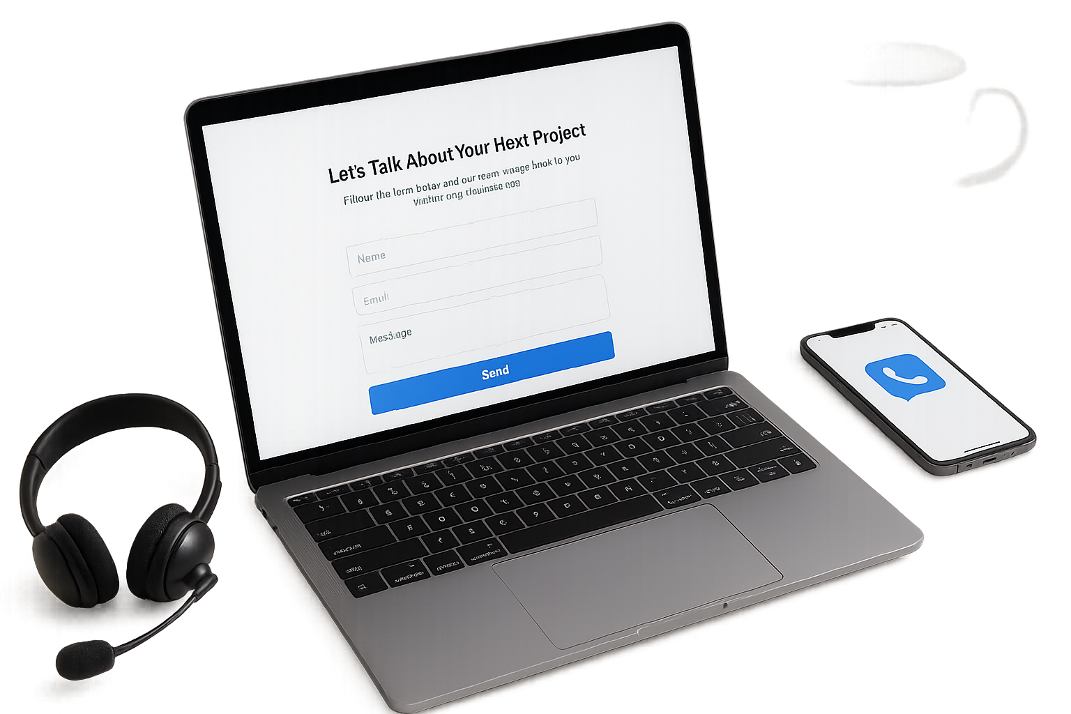
In summary, adaptive design is not just a trend; it’s a necessity for modern businesses. As your customers expect smooth experiences on all devices, the need for adaptive design grows. Want to ensure your website meets these demands? Contact us at nexrilo.com or call us at [email protected] to learn how we can help you implement industry-standard adaptive designs. Our professional specialists, with 20 years of experience, guarantee that you will receive all services in one place—saving you time and hassle. Don’t wait; lets enhance your website today! ⭐
What is the Difference Between Responsive and Adaptive Design: Debunking Common Myths?
When discussing modern web design, the terms responsive design and adaptive design often pop up. But what is the difference between adaptive and responsive design? Many people misunderstand these concepts, leading to confusion about which approach is best for their website. Let’s dive in and debunk some common myths surrounding these two popular design methodologies. ⭐
Understanding Responsive Design
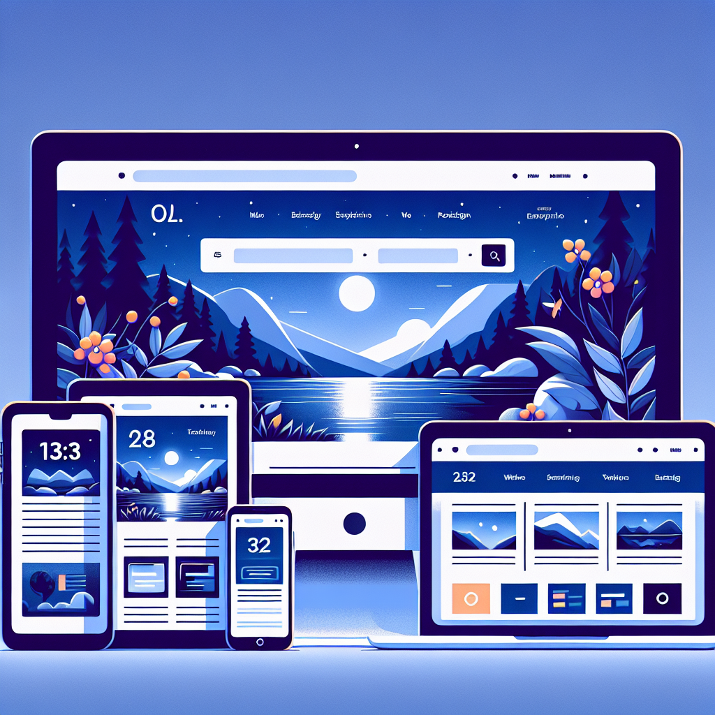
Responsive design is like a fluid chameleon, effortlessly adjusting its layout to fit any screen size. It uses CSS media queries to detect the user’s screen size and orientation, resizing elements to create a seamless experience across devices. This means whether someone accesses your site from a smartphone, tablet, or desktop, they’ll have a consistent browsing experience.
Understanding Adaptive Design
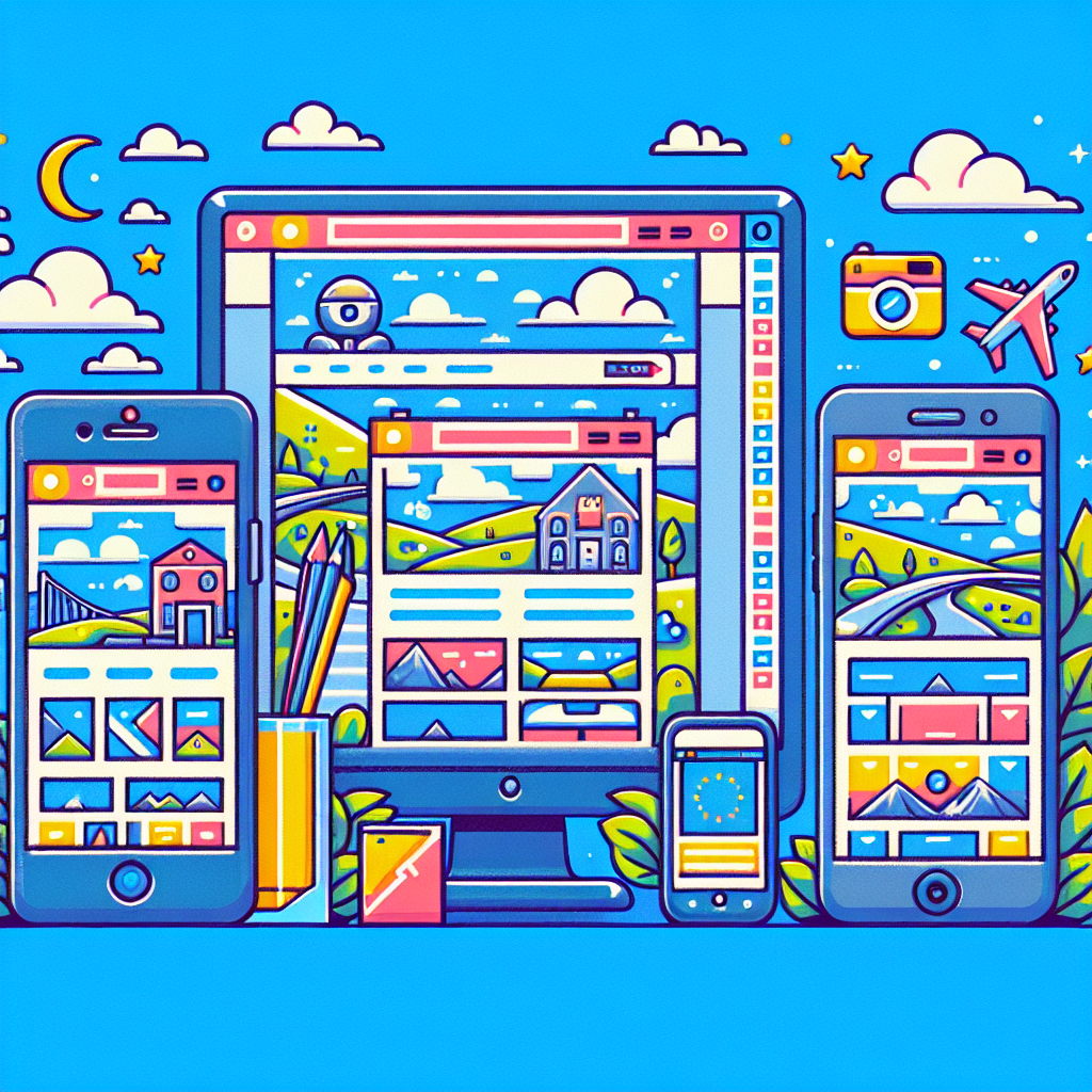
In contrast, adaptive design takes a more tailored approach. It employs a series of distinct layouts optimized for specific screen sizes. When a user visits a site, it detects the devices capabilities and delivers the best layout suited for that screen. Think of it as a store having different setups for various customer types. For instance, when it knows someone is visiting on a smartphone, it presents a mobile-optimized version instead of trying to fit the desktop layout into the small screen. ⭐⭐
Key Differences Between Responsive and Adaptive Design
- Flexibility vs. Fixed Layouts: Responsive design allows fluidity across all devices, adapting continuously, whereas adaptive design offers fixed layouts determined by device detection.
- Development Approach: Responsive design typically requires a single version of a website, while adaptive design needs multiple layouts for different screens, making it a bit more complex to develop.
- Performance: In general, adaptive designs may load faster because they deliver only the necessary assets for each device, while responsive designs may retrieve more data than needed for larger screens.
- User Experience: With responsive design, users experience seamless scrolling and reorganized elements based on their screen size. In contrast, adaptive design focuses on providing a designated experience tailored to the device in use. ⭐
Common Myths Debunked
- Myth 1: Responsive design is more modern than adaptive design.
- Reality: Both designs have their strengths! Sometimes, adaptive is more suitable, especially for specific user needs and quick-loading sites.
- Myth 2: Adaptive design is outdated.
- Reality: Not at all! Adaptive design is quite relevant, especially for larger sites needing distinct layouts to cater to diverse users.
- Myth 3: You can only choose one approach.
- Reality: You can combine both! Some websites adopt a hybrid approach, utilizing the strengths of responsive and adaptive design to enhance user experience.
Real-World Example
Let’s look at an example to clarify. Picture an online clothing retailer. If they chose responsive design, a user shopping on their mobile device would see the full website, albeit scaled down. Images might appear small, and buttons could be tough to click. In contrast, if they implemented adaptive design, the mobile user would receive a layout with larger buttons, fewer columns, and a straightforward checkout process. This ensures a better shopping experience, ultimately leading to more conversions! ⭐️
Contact Us to Discuss Your Needs!
Understanding the difference between adaptive and responsive design can significantly impact your website’s effectiveness. Whether you choose to employ a responsive design or opt for the more tailored approach of adaptive design, our experienced team at nexrilo.com can help you implement the perfect solution for your business. With over 20 years of experience, our professional specialists are equipped to provide you with a full spectrum of services—from design to technical support. Don’t hesitate! Reach out today at [email protected] or visit nexrilo.com to get started. ⭐
Fill out the form below and our team will reach out within one business day