Discover the Importance of Responsive Designs and Website Adaptability for Optimal User Experience

What is a Websites Adaptability and Why It Matters in Todays Digital Landscape?

In a world where our lives are intertwined with technology, what is a websites adaptability? Simply put, it is the ability of a website to adjust its layout and functionalities according to the device its being viewed on—be it a desktop, tablet, or smartphone. For instance, imagine trying to navigate a website on your phone that looks exactly like it does on a computer. It would be a frustrating experience, wouldnt it? The importance of adaptability in websites is paramount in todays digital landscape. Statistics reveal that mobile devices account for over 54% of global web traffic. That’s a huge audience you could be missing out on if your website isnt adaptable!
But why does this matter? As consumers, we expect seamless experiences whether were browsing from home or on the go. If a website is difficult to navigate, theres a high chance users will leave within seconds. A staggering 40% of people abandon a website that takes more than three seconds to load. This is where responsive design comes into play. Its not just about looking good on every device; it’s about functionality that enhances user experience and satisfaction.
Why You Cant Ignore Responsive Design
Responsive design is at the heart of what does responsive design mean? It’s all about creating dynamic changes to the appearance of a website based on the size of the screen. Responsive websites adapt layouts, images, and functionalities to provide the best user experience. Lets look at a practical example: consider an online shoe store. A responsive website allows the product images and categories to seamlessly resize according to the device. This ensures that whether youre at home browsing on a laptop or on the subway flipping through your phone, the experience remains consistently enjoyable.
| Device | Recommended Design Approach | Key Features |
| Desktop | Full-width layout | Multiple navigation options, larger images |
| Tablet | Fluid grid | Collapsible menus, slightly sized images |
| Smartphone | Mobile-first design | Single-column layout, large touch targets |
For Which Resolutions Should Adaptability Be Made?
The question of for which resolutions should adaptability be made? is vital. You need to consider the most common resolutions your audience is using. Typically, it’s effective to aim for standard breakpoints such as 320px, 768px, and 1024px. These dimensions capture the majority of users, ensuring your layout looks good on devices ranging from small phones to large desktops. Remember, when your users can easily access your website, they are more likely to stay and explore!
How Should a Responsive Website Look?
Wondering how should a responsive website look?? A well-designed responsive website adjusts not just its dimensions but also its content layout. Instead of fixed dimensions, elements should be set in percentage units so they resize fluidly. It should include intuitive navigation, readable text without the need for zooming, and a visually appealing layout. For example, when you check a restaurants website, you want to see a menu that’s easy to browse and images that draw you in, all without horizontal scrolling!
What Does the Use of Responsive Layout on a Website Lead To?
Implementing a responsive layout leads to multiple benefits, which include:
- ⭐ Improved User Experience: A site that adapts looks professional and is easier to navigate.
- ⭐ Higher Conversion Rates: Users are more likely to engage and complete a purchase when the site is user-friendly.
- ⭐ Better SEO Performance: Google favors responsive designs, which could boost your search rankings.
- ⭐ Cost Efficiency: Instead of maintaining separate sites for mobile and desktop, one responsive site suffices.
As an IT development company, we at nexrilo.com understand that quality web development is crucial. With over 20 years of experience and a team of professionals, we offer a full spectrum of services, from software development to technical support. You wont need to juggle multiple companies to meet your needs. Curious about how to test the responsiveness of a website? We have the tools and expertise to provide comprehensive testing and optimization for your site. Our dedicated customer relations manager, Ecaterina, is here to guide you throughout the process.
So, how much does a responsive website cost? You’ll be pleased to know that we offer competitive pricing tailored to your needs. From a basic responsive layout starting at 400 EUR to today’s most advanced e-commerce solutions at 5850 EUR, we provide access to an array of services—everything you need is in one place, ready to transform your IT capabilities. ⭐
Don’t miss out on tapping into the growing mobile user base! Call us today at [email protected] or visit nexrilo.com to get started on your journey to a more adaptable and user-friendly website.
Frequently Asked Questions
- What is websites adaptability? Its the design approach allowing a website to look and function well across different devices.
- How does responsive design improve user experience? It ensures that content is easily readable and navigable on any screen size.
- For which resolutions should I optimize? Common breakpoints include 320px, 768px, and 1024px for various devices.
- How to test the responsiveness of a website? You can use tools like Google’s Mobile-Friendly Test or responsive design checkers.
- What does responsive layout lead to? Improved user engagement, SEO performance, and cost efficiency in maintenance.
- How should a responsive site display images? Images should be fluid to adjust to the screen size while maintaining clarity.
- What are the main advantages of responsive design? Adaptability, improved SEO, cost savings, and a better user experience.
- How can I ensure my site remains responsive with future updates? Regular testing and updates will keep your design compatible with new devices and browsers.
- What is the cost of responsive web development? Costs vary, starting around 400 EUR for basic designs to higher for extensive e-commerce solutions.
- Can I transform my existing site into a responsive one? Yes! Our team can help you adapt your current site for better performance on all devices.
How Does Responsive Design Transform User Experience Across Multiple Resolutions?

Have you ever tried accessing a website on your phone only to find it squished, requiring constant pinching and zooming? This frustrating experience is a thing of the past, thanks to responsive design! Understanding how responsive design transforms user experience across multiple resolutions is crucial in today’s digital world. It’s all about ensuring that websites look great and function flawlessly whether youre on a laptop, tablet, or smartphone. Let’s explore how this works and why it matters to you!
The Essentials of Responsive Design
Responsive design allows a website to automatically adapt its layout based on the device being used. This involves using fluid grids, flexible images, and CSS media queries to create a seamless viewing experience. But what does that really mean in practice? It means:
- ⭐ Websites that adjust their layout to fit various screen sizes.
- ⭐ Images that resize without losing quality, no matter the device.
- ⭐ Unique CSS styles tailored for different resolutions.
Impact on User Experience
So, what does the use of responsive layout on a website lead to? Lets dive into the key benefits that responsive design brings to user experience:
- ⭐ Improved Navigation: No matter the device, a responsive website provides easy navigation, reducing frustration and bounce rates.
- ➡️ Faster Loading Times: Optimized images and streamlined coding make pages load quicker, especially important for mobile users who may have slower connections.
- ⭐ Consistency Across Platforms: A coherent look and feel whether it’s the desktop, tablet, or mobile, helps strengthen brand recognition and trust.
- ⭐ Enhanced SEO: Google prefers responsive sites as they provide a better user experience, which can lead to higher search rankings.
Real-Life Example: The Retail Brand
Let’s take the example of a retail brand. Imagine you’re browsing a clothing store’s website on your phone to find the perfect outfit. A well-implemented responsive design means you encounter clear product photos, clickable links, and a smooth checkout process. Contrast this with a non-responsive site, where you might find images that don’t fit the screen properly and buttons that are too small to click. Which experience would you choose? A seamless experience leads consumers to stay on your site longer and, ultimately, make a purchase.
How Responsive Design Accommodates Different Resolutions
Different users have different devices, and each comes with its own resolution. For which resolutions should adaptability be made? Here’s a breakdown:
| Device Type | Common Resolutions | Design Considerations |
| Smartphone | 320px to 480px | Single-column layout, touch-friendly elements |
| Tablet | 600px to 768px | Fluid grid layout, horizontal navigation |
| Laptop/Desktop | 1024px and above | Multi-column layout, larger images |
Testing Your Design for Responsiveness
Wondering how to test the responsiveness of a website? Here are a few tools and tips to do just that:
- ⭐ Google’s Mobile-Friendly Test: Analyze how well your site performs on mobile devices.
- ⭐ Responsive Design Checker: Input your URL and see how it appears across various devices.
- ⭐ Browser Developer Tools: Use built-in tools in browsers like Chrome to toggle device views.
Need Help? Were Here!
At nexrilo.com, our professional specialists have over 20 years of experience turning your visions into reality. From initial design concepts to final implementations, we ensure that your website is responsive and user-friendly on all devices. Curious about how much does a responsive website cost?? Our packages are tailored to fit varied budgets, starting from as low as 400 EUR for an optimized layout.
So why wait? Reach out to us today by calling [email protected] or visiting nexrilo.com. Let’s take your website to the next level together! ⭐
Frequently Asked Questions
- What does responsive design mean? Its a web design approach that allows websites to adapt to different screen sizes.
- How does responsive design improve user experience? It provides a seamless browsing experience regardless of the device used.
- Why is responsive design important for mobile? Most web traffic comes from mobile devices, making it crucial for user engagement.
- What should I consider when implementing responsive design? Focus on layout flexibility, image optimization, and navigation simplicity.
- How to determine the right resolutions for my website? Target common device breakpoints based on your audiences usage patterns.
- Can I still make my website responsive if it’s already built? Yes! We can help you adapt your existing site to be responsive.
- What tools can I use to test responsiveness? Tools like Google’s Mobile-Friendly Test and responsive design checkers are very useful.
- How often should I test my website? Regular checks are recommended, especially after major updates or redesigns.
- What are the costs associated with responsive web design? Costs can vary, but our packages start from around 400 EUR.
- How long does it take to make my website responsive? The timeline can depend on the complexity of your site; we provide detailed estimates!
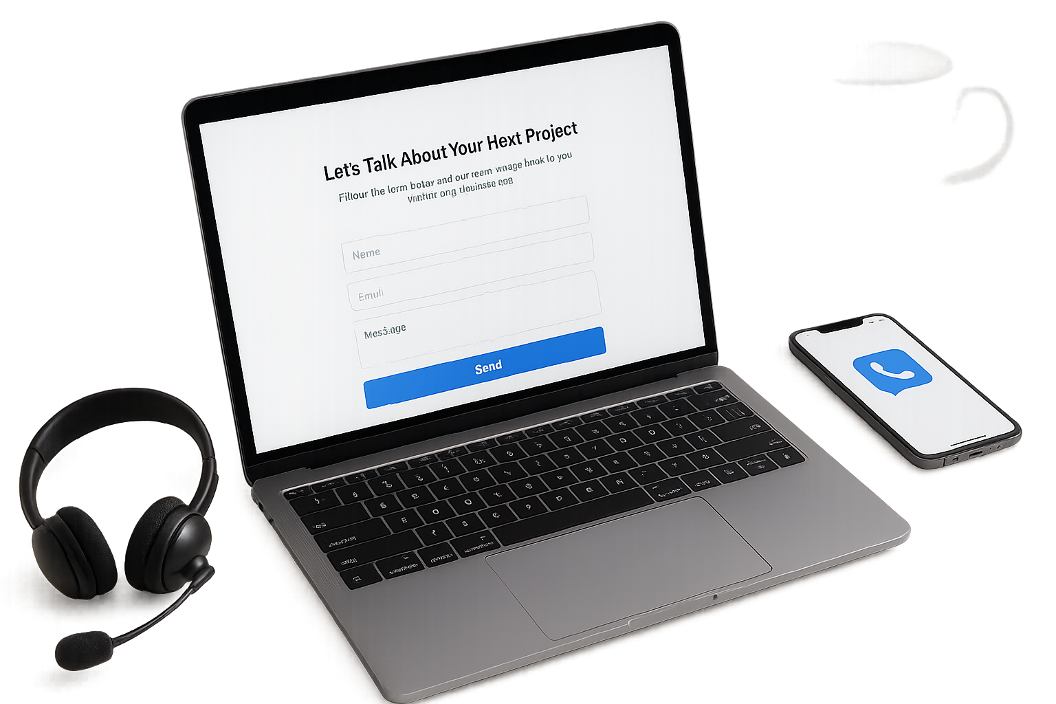
Fill out the form below and our team will reach out within one business day